TL;DR
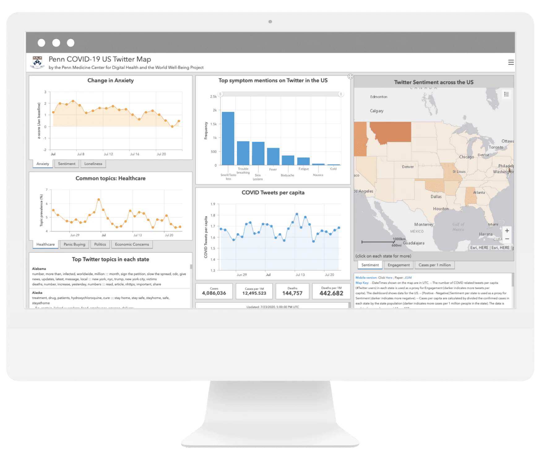
I was the sole designer for a public health dashboard that translated more than one million COVID-related tweets into patterns researchers and policymakers could explore. In three weeks, I defined the information architecture, partnered with data scientists and a psychologist on meaningful measures, and designed within ArcGIS constraints.
Turning public conversation into a health signal
During COVID-19, public health teams needed faster ways to understand how physical symptoms, emotional stress, and public concerns were changing across the United States.
Penn Medicine’s Center for Digital Health was collecting large volumes of public Twitter data. The opportunity was not simply to display it. We needed to help health departments, health systems, researchers, and policymakers connect noisy social data to questions they could act on.
My role
As the only designer on the project, I:
- Led the information architecture, interaction model, and visual design.
- Partnered directly with data scientists and a psychologist on data selection and interpretation.
- Helped build the dashboard front end in ArcGIS.
- Presented decisions directly to the department lead.
Three constraints shaped the work
The project had a three-week timeline, no dedicated research capacity, and significant visual and technical constraints within ArcGIS Online.
That changed how I worked. Instead of treating research, data definition, and interface design as separate phases, I brought the full team into rapid prototype reviews. A psychologist could challenge whether a measure was meaningful, a data scientist could flag processing cost or missing data, and stakeholders could react to the interface in the same conversation.
A chart was only useful if people could understand what it measured, compare it with another signal, and know what question to ask next.
Building connections across three scales
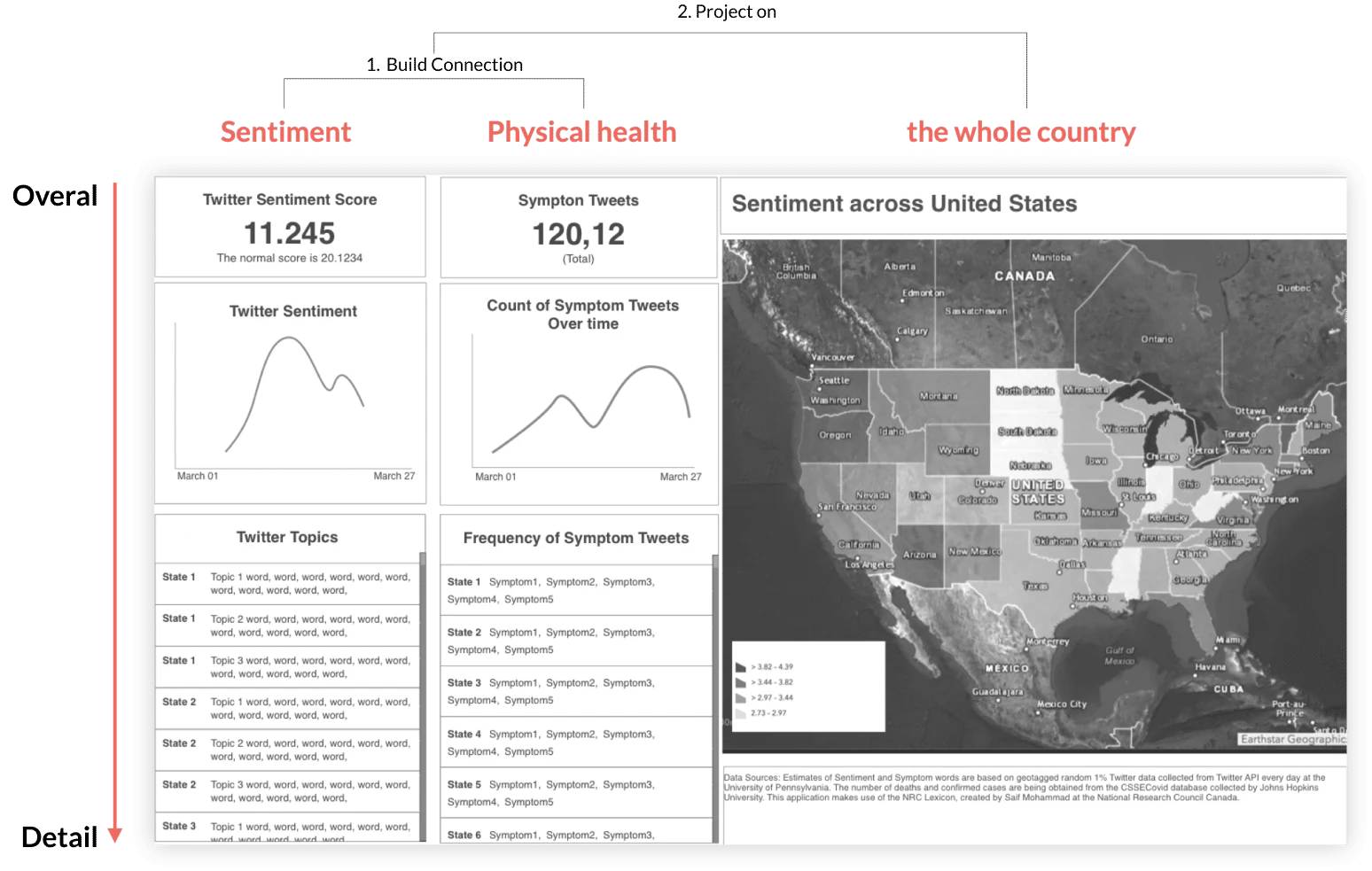
The first information architecture moved from overview to detail and from individual signals to a national picture:
- Sentiment: how emotional language changed over time.
- Physical health: how often people mentioned COVID symptoms.
- Geography: where patterns appeared across the United States.
Placing sentiment and symptom data side by side allowed viewers to explore whether emotional changes aligned with physical-health concerns. The map then helped them zoom out from a trend to its geographic context.
Designing for an uncertain delivery scope
Data processing was the largest schedule risk. I worked with the data scientist on alternatives that preserved the core comparison experience while reducing implementation effort.
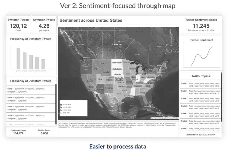
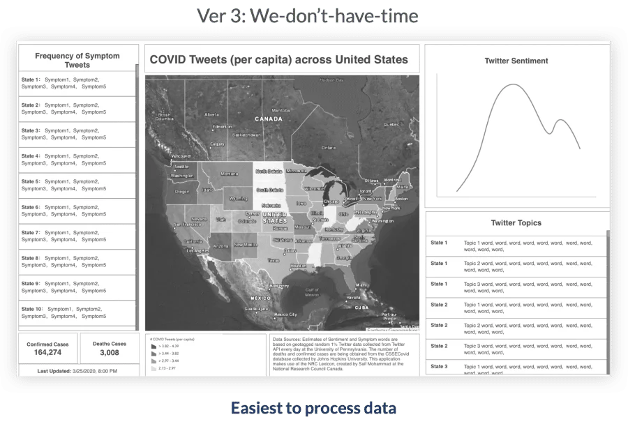
This gave the team a deliberate scope ladder rather than forcing a last-minute compromise.
Making sentiment interpretable
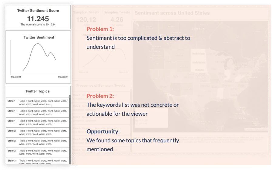
The first concept used a single sentiment score and a list of tweet fragments. Team reviews exposed two problems:
- A blended sentiment score was too abstract to support a decision.
- Raw keyword fragments lacked enough context to reveal a useful pattern.
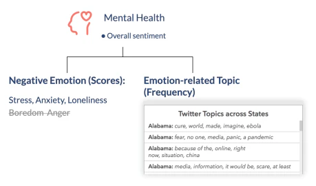
I worked with the project manager, psychologist, and data scientist to break “sentiment” into more legible measures. Drawing on CDC references and patterns available in the dataset, we separated:
- Negative emotional signals such as stress, anxiety, loneliness, and boredom.
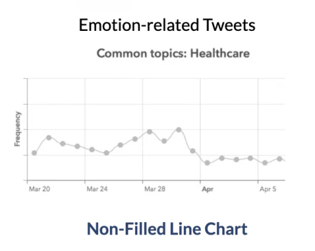
- The frequency of concrete concerns such as healthcare, panic buying, and economic uncertainty.
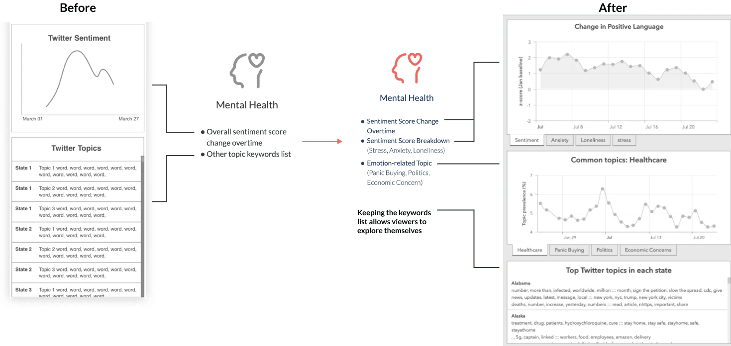
The revised architecture replaced one opaque score with charts whose labels described the actual topic being measured. It also retained keyword examples as supporting context rather than presenting fragments as the primary insight.
Choosing a chart for incomplete data
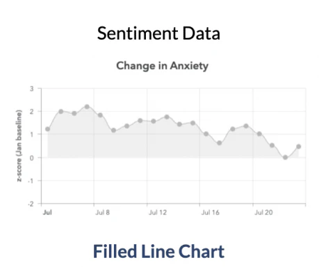
Twitter data was not available for every day. The visualization needed to acknowledge discrete observations without making the dashboard feel broken or exaggerating certainty.
I compared four approaches:
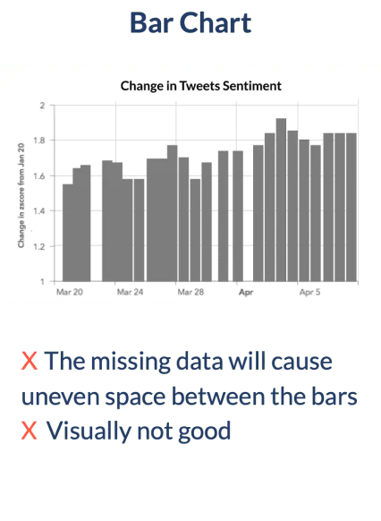
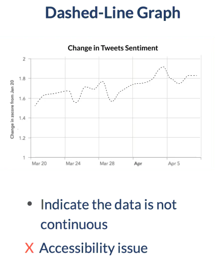
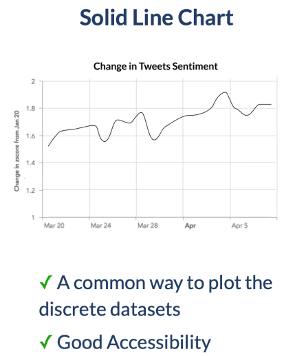
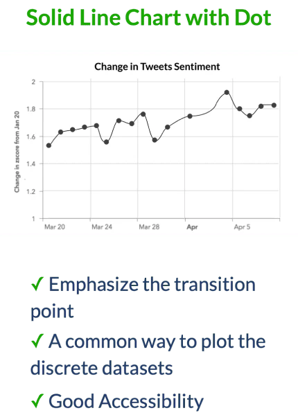
I selected a connected line because it was familiar, readable, and commonly used for discrete time-series observations. For sentiment, a subtle area fill gave emotional trends enough visual emphasis to anchor the dashboard.
Designing color within ArcGIS constraints
The dashboard displayed mental- and physical-health data at the same time, but ArcGIS offered a limited set of combinations. The palette needed to:
- Work within the platform’s available colors.
- Keep the two data families distinguishable.
- Remain legible across common forms of color-vision deficiency.
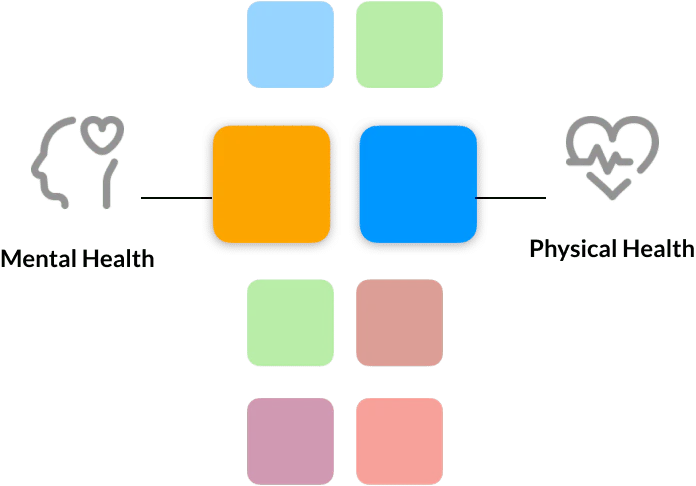

I tested the final pair in a color-blindness simulator across nine conditions. The colors remained distinguishable, so accessibility became the deciding factor rather than visual preference alone.
Outcome
The dashboard gave public-health teams a way to explore physical symptoms, emotional signals, public concerns, and geography in one system. The work:
- Translated more than one million tweets into interpretable public-health signals.
- Supported mental-health and big-data research.
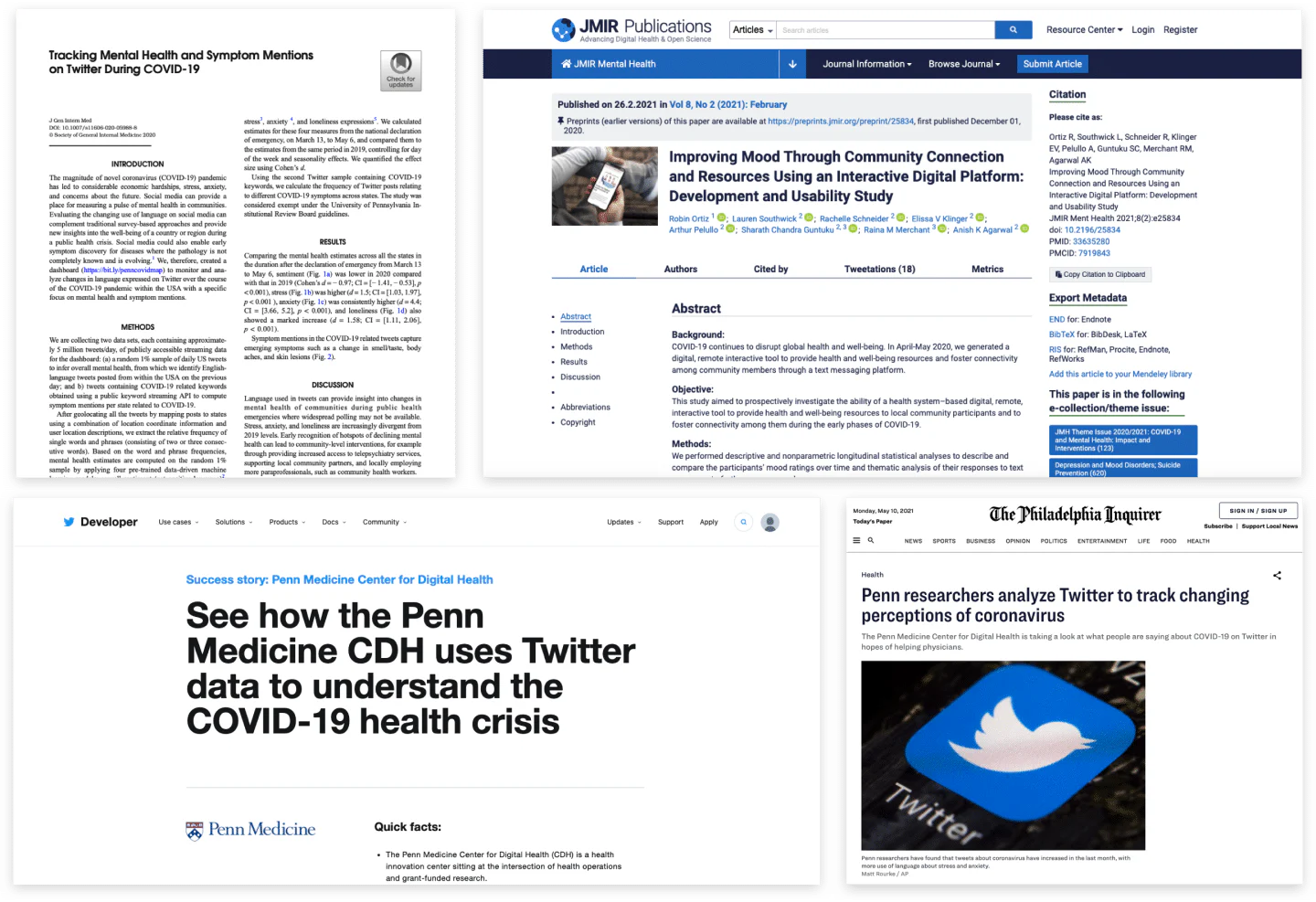
- Was featured by Twitter Developer and The Philadelphia Inquirer.
- Established a cross-disciplinary process for deciding not only how to visualize data, but what the data should mean in the interface.
Reflection
This project changed how I think about data products. Visualization begins before choosing a chart. It begins by deciding which model output deserves to become a visible concept, what uncertainty the interface must preserve, and which comparisons help people form a responsible interpretation.
That lesson continues to shape my work on AI and complex systems: the interface should not merely expose an algorithm’s answer. It should help people understand what the answer represents and how much confidence to place in it.