TL;DR
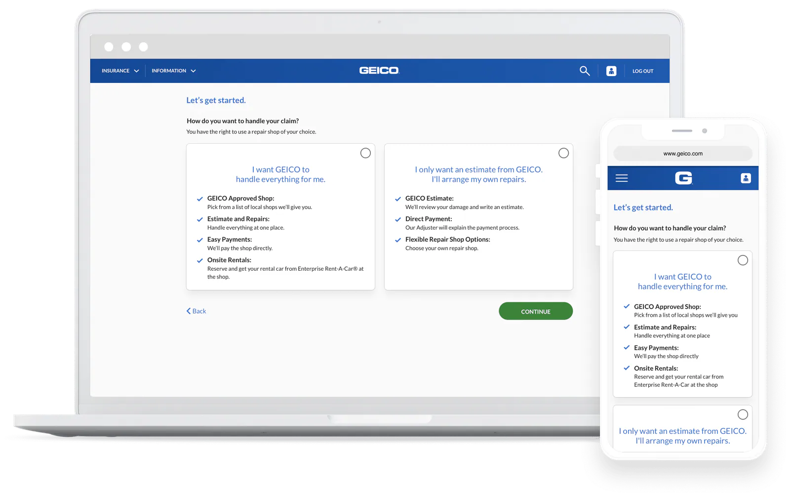
I redesigned a fragmented damage inspection and repair scheduling experience into one flexible, guided flow. The shipped work increased scheduling completion by 10.2% and click-through from the damage inspection summary by 21%.
The challenge
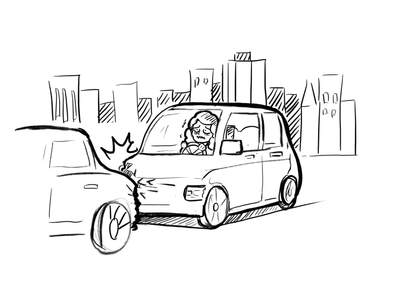
After a car accident, policyholders are already worried about cost, safety, transportation, and getting their car back. The existing experience asked them to make several unfamiliar decisions at once: how to receive an estimate, where to repair the vehicle, and whether they needed a rental car.
GEICO offered four separate scheduling flows based on service eligibility. That made the claims system harder to maintain and created inconsistent experiences for customers.
My role
I was the sole designer on the project. I:
- Led the end-to-end interaction design, from wireframes through prototype.
- Partnered with UX research on moderated and unmoderated testing.
- Worked with the product owner, claims engineering, business partners, and a UX writer.
Building context before designing
I reviewed previous unmoderated research and competitive studies, watched 2.6 hours of Quantum Metric sessions, and completed a heuristic analysis of the live experience.
That work surfaced four connected problems.
What was getting in the way

1. Four flows created inconsistency
Customers received different screens and functionality based on eligibility. Features such as rental service appeared in some paths but not others, creating both comprehension and system-scaling problems.
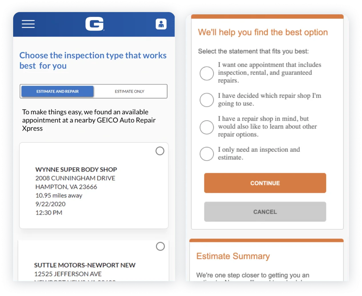
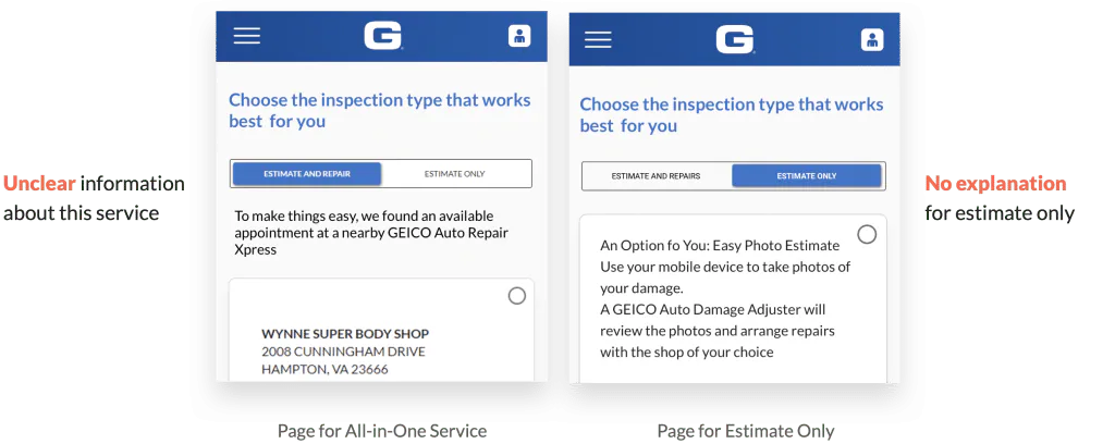
2. One page carried too many decisions
The most-used path tried to accelerate scheduling by placing every decision on one page. Instead, the density made it harder to understand what to choose next.
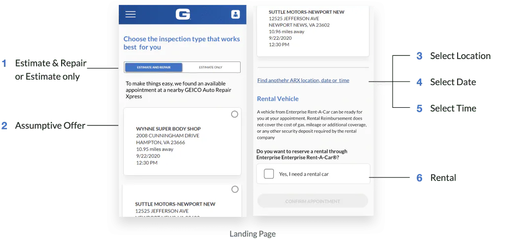
3. Options lacked useful comparison points
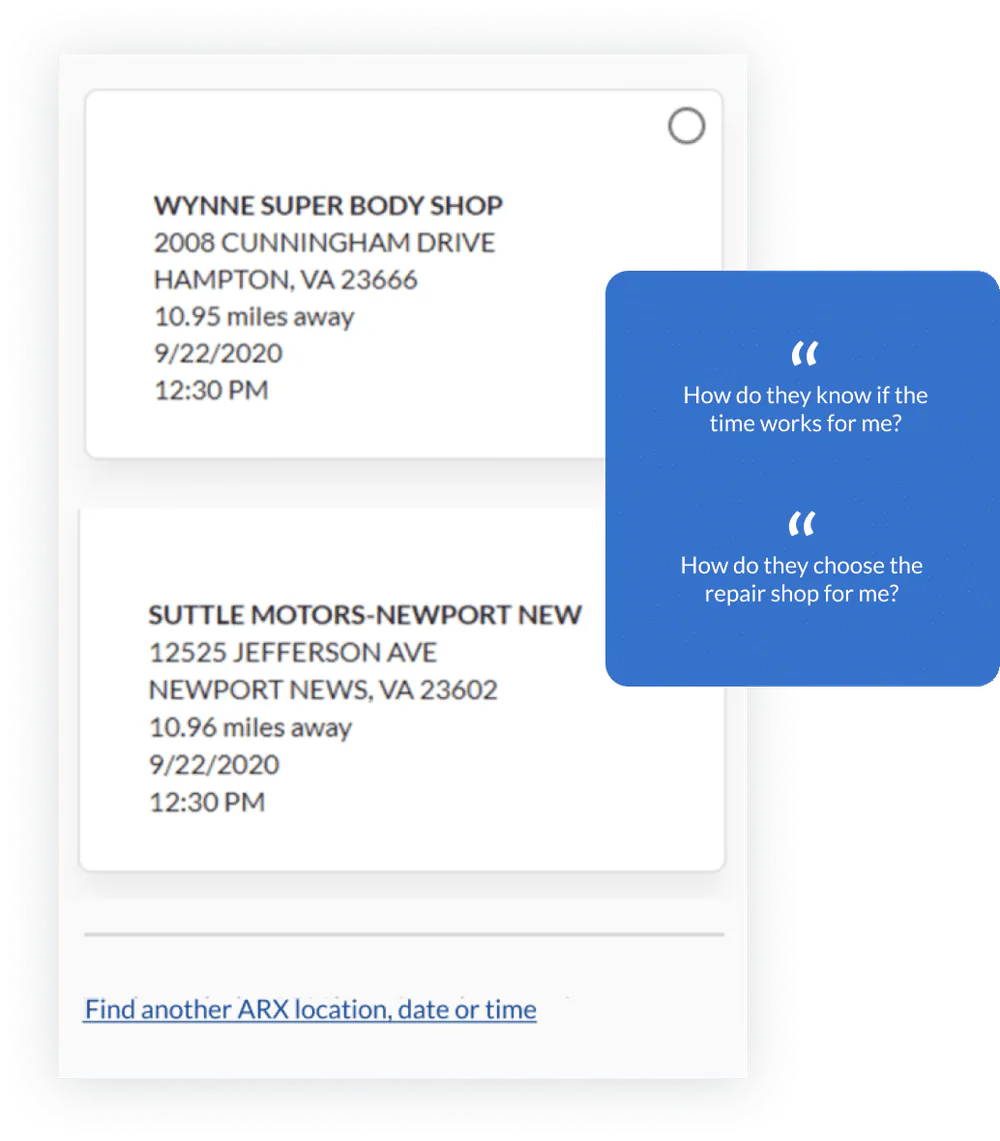
Customers could not easily tell the difference between estimate and repair options. An “assumptive appointment” also selected an early nearby appointment without first confirming availability, raising more questions than it removed.
4. Internal terminology leaked into the experience
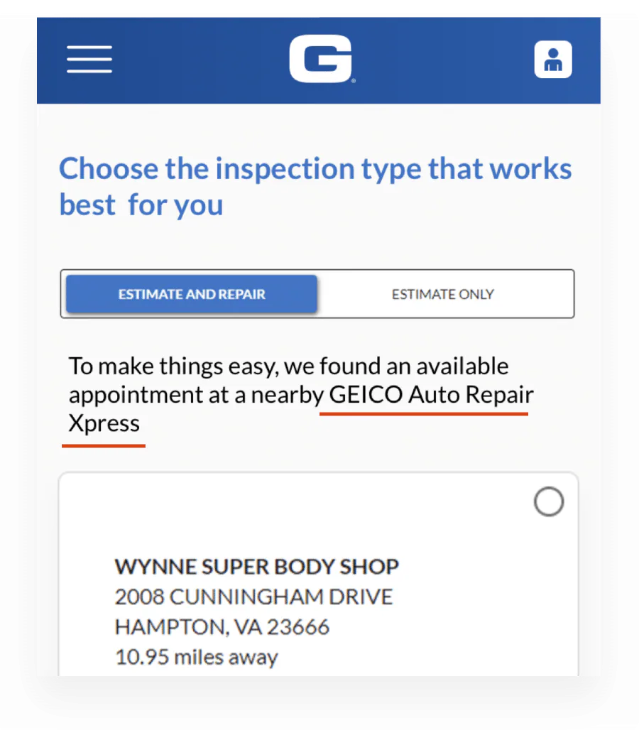
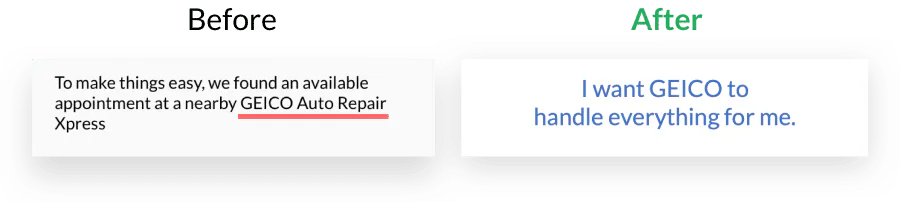
Labels such as “ARX” made sense inside the organization but not to policyholders. Some customers interpreted the unfamiliar term as a lower-quality repair option.
“When people can’t decide, they don’t decide.”
The design direction became clear: reduce simultaneous decisions, make options easier to compare, and replace internal terminology with plain language.
Reconstructing the flow
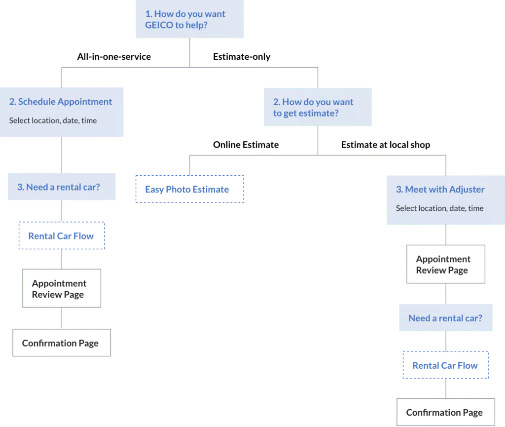
Rather than patching four separate experiences, I broke the journey into independent steps that could be included or skipped based on eligibility.
This created one scalable scheduling flow while revealing only the information needed for the current decision.
The final user flow
The revised flow supported both “search by location” and “search by date,” while placing rental, review, and confirmation steps where they made sense for each service path.
Making choices easier to scan
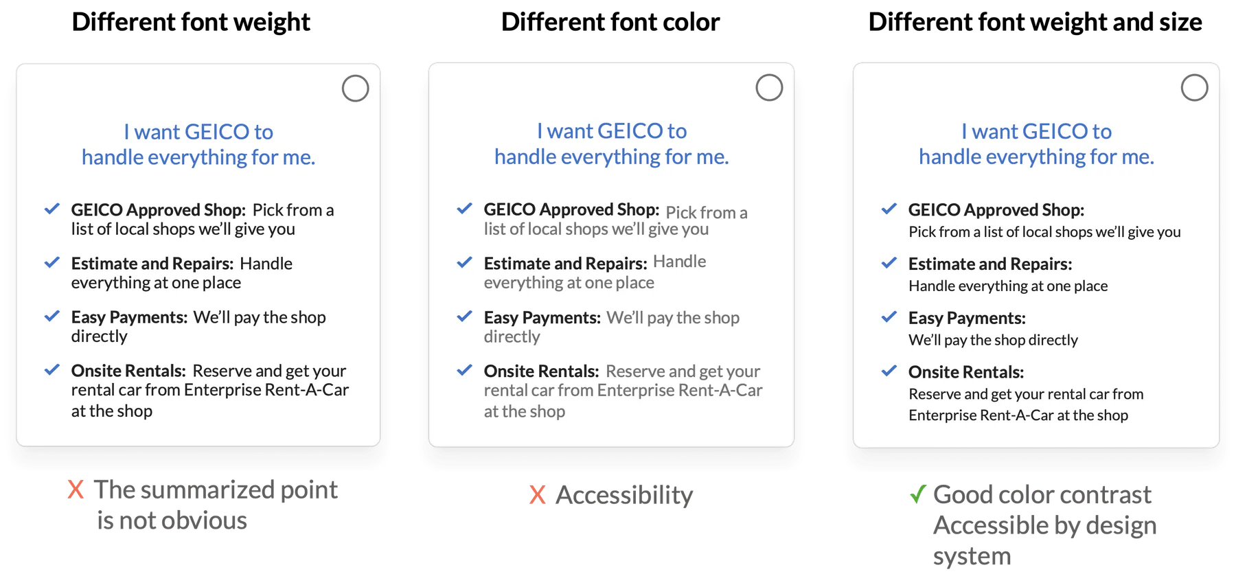
Research showed that customers skimmed before committing to an option. I replaced dense descriptions with selection cards that surfaced clear benefits, short summaries, and checkmarked comparison points.
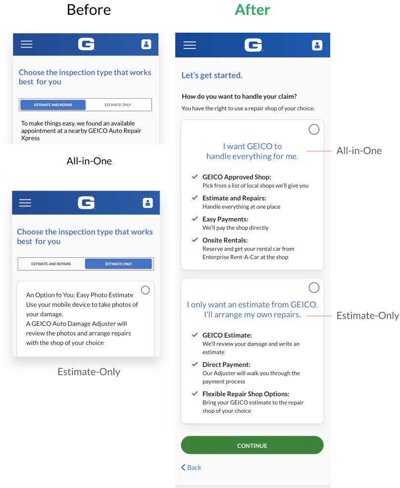
I also partnered with a UX writer to remove jargon and describe services in language customers could recognize.
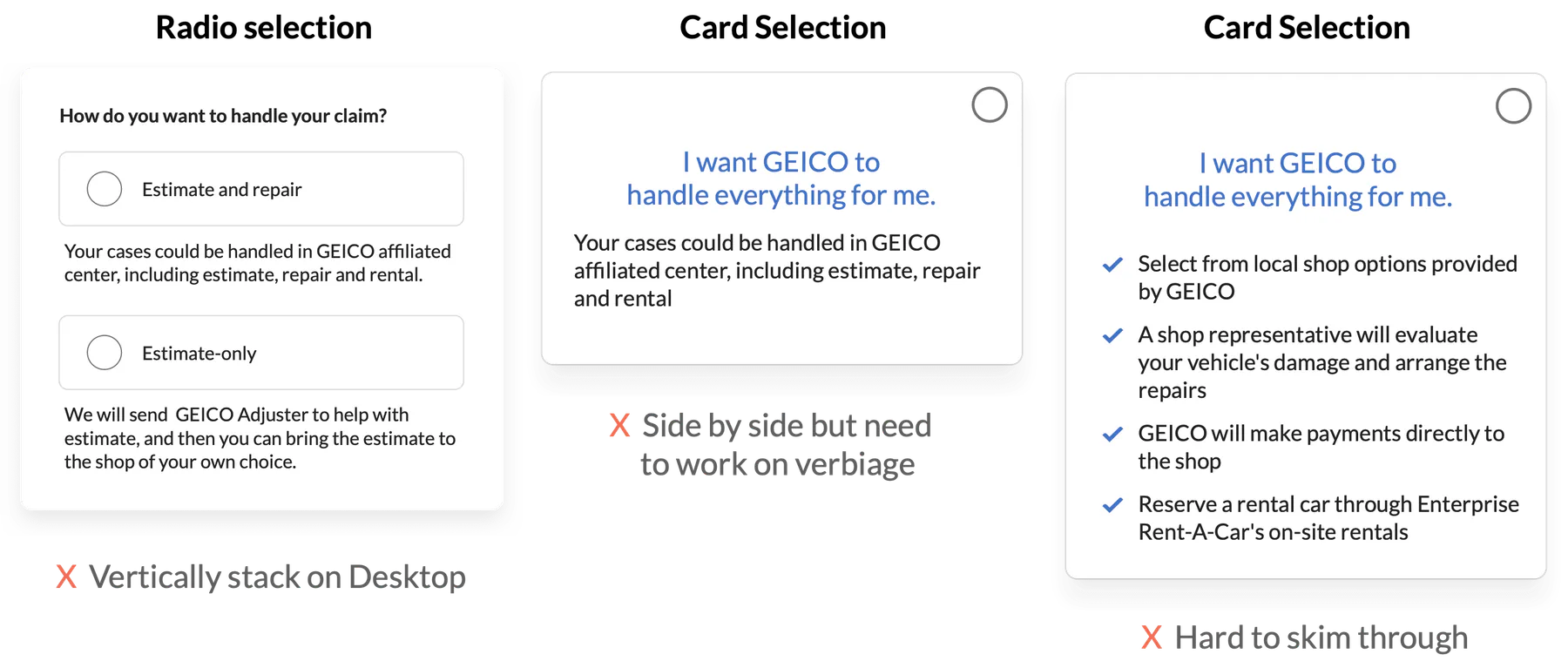
Iterating on content and hierarchy
We tested multiple versions to balance completeness with scanability. Bold summary lines helped users understand an option first, then decide whether they needed the supporting detail.
Testing “search by date”
The existing date-first flow asked customers to choose a date, time, location, and shop across several screens. If no shop was available, they had to backtrack to the beginning.
I questioned whether the additional search mode was necessary, then worked with research to test when it helped. Four of seven participants valued searching by date, especially people with constrained schedules.
“I’m a full-time student. I’ll choose by date because my calendar is usually full.”
The opportunity
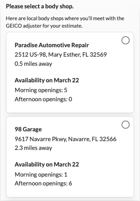
Instead of narrowing choices across three disconnected pages, the new concept kept shop availability visible and made it easier to compare alternatives without restarting.
“Wish there was more flexibility.”
“Want to see a wider range of availability.”
Design
Outcome
The redesigned experience established a shared, scalable structure for scheduling estimates, repairs, and rental services. After launch, it:
- Increased scheduling completion by 10.2%.
- Increased click-through from the damage inspection summary by 21%.
- Replaced four fragmented paths with one eligibility-aware flow.
- Made service differences and next steps easier to understand during a stressful moment.
The project reinforced that simplifying a complex workflow does not mean removing necessary choices. It means sequencing them, giving each choice enough context, and letting the system handle complexity without passing it to the customer.