
GEICO Design Exercise: Redesign the Auto Insurance Website
Design Overview
GEICO’s website provides customer facing access for sales, service, claims, and other features. One of the company’s goals is to increase downloads of and traffic to the GEICO Mobile app for existing customers. Another goal is to maintain or improve self-service metrics. Your assignment is to review the following page and design changes that serve both customer and company goals. The solution should work across all breakpoints
Deliverables
Responsive website for Desktop, Ipad, mobile size
- Design process
Time
3 days
Tools: Figma, Adobe Creative Suite
Clarification
The Goal
Increase downloads of and traffic to the GEICO Mobile app for existing customers
- Maintain or improve self-service metrics (start a quote)
* There many potential self-service metrics for this page, get more people to start a quote, increase the log in number, and get more people to buy the quote.
I decided to go with “Start a quote” for self-service metrics, since this is the primary task for the original page. For the buying a quote, usually users need to finish the personal information input, and receive various quote through email or phone before actually buying them
Who are the target users
There are three major users for this website:
- Exciting customer: come to web page and log in to make payment, Claims filing, etc.
- The new customer whoever need to buy one insurance (probably still looking at other insurance company) with very basic insurance-related knowledge
- The customer whoever want to switch to new insurance (have experience in buying insurance), looking for something unique and they can get more benefits
Research
I quickly I did some competitor research to see how other products. I interviewed with 1 GEICO users and 2 regular insurance buyer to understand their mindset when buying insurance
I learned that for the people new to insurance, it’s hard for them to digest the information, since they should think about price, coverage, claims, etc. It’s essential to think about how to balance the insurance’s selling point, user education and avoid overwhelming information.
I also conducted analysis for current page to identify opportunity of improvement. It has the 7
1. Informative but overwhelming
2. Professional but not easy-going
3. Non-structural
4. Start-quote-focused but Hard-to-find download entry for app
5. Lack of value-prop (no different from other insurance)
6. Distracting hyper link
7. Confusing text
Explore and sketch
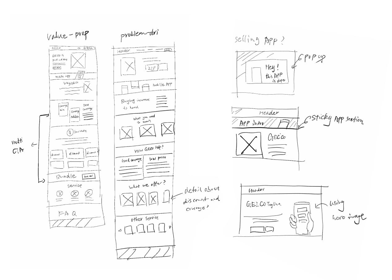
My sketches focus on storytelling with consideration of information architecture and design structure.
1.Value-proposition-focused. It highlights the uniqueness of GEICO car insurance and guide users from coverage, prices, and services details. Based on the research, I learned that the biggest selling point for GEICO (which is also what recognized by users is: GEICON is providing low-cost insurance and extremely flexible coverage option for users. I separately highlight this two selling points in this version.
Structure: Header – Hero image – Mobile app intro – Why GEICO – Good coverage – Attractive price – Service for your – Q&A – Footer.
2. Need-driven and user education. Starting from the needs and problem “I know buying an insurance is hard, but I still need it anyway”. Then how can GEICO help with it. The purpose is to streamline the experience for first-time insurance buyer. Also help them understand the insurance
Structure: Header – Hero image – Mobile app intro – Why you need car insurance – What concepts you need to know – GEICO can make it easy – We offer insurance meet the requirement in most statesment – Our services guratee your drive safety – Q&A – Footer.
After getting feedback from the target users. The value-prop storytelling get most response. People who are not familiar with insurance also had positive response to the second structure. The problem is that explaining all the info will potentially overwhelm users, and jeopardize customer who are switching insurance.
Wireframing
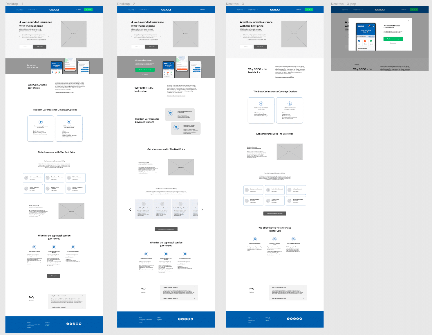
In this process, explored different design structures and the ways to realize the goal of increasing the traffic of app.
Another idea is: I take out the log in button on the header, and put it in the mobile app intro section (replaced with text link). Encourage existing customer to take look at mobile app with prominent CTA which will guide them to the app page.
Problem: changing the header isn’t always the best choice since it will affect other page
The third idea is: when existing user click the log in, a pop-up window shows introduction of mobile application
Problem: Pop-up window is distracting and offensive. It feels force user to do something.
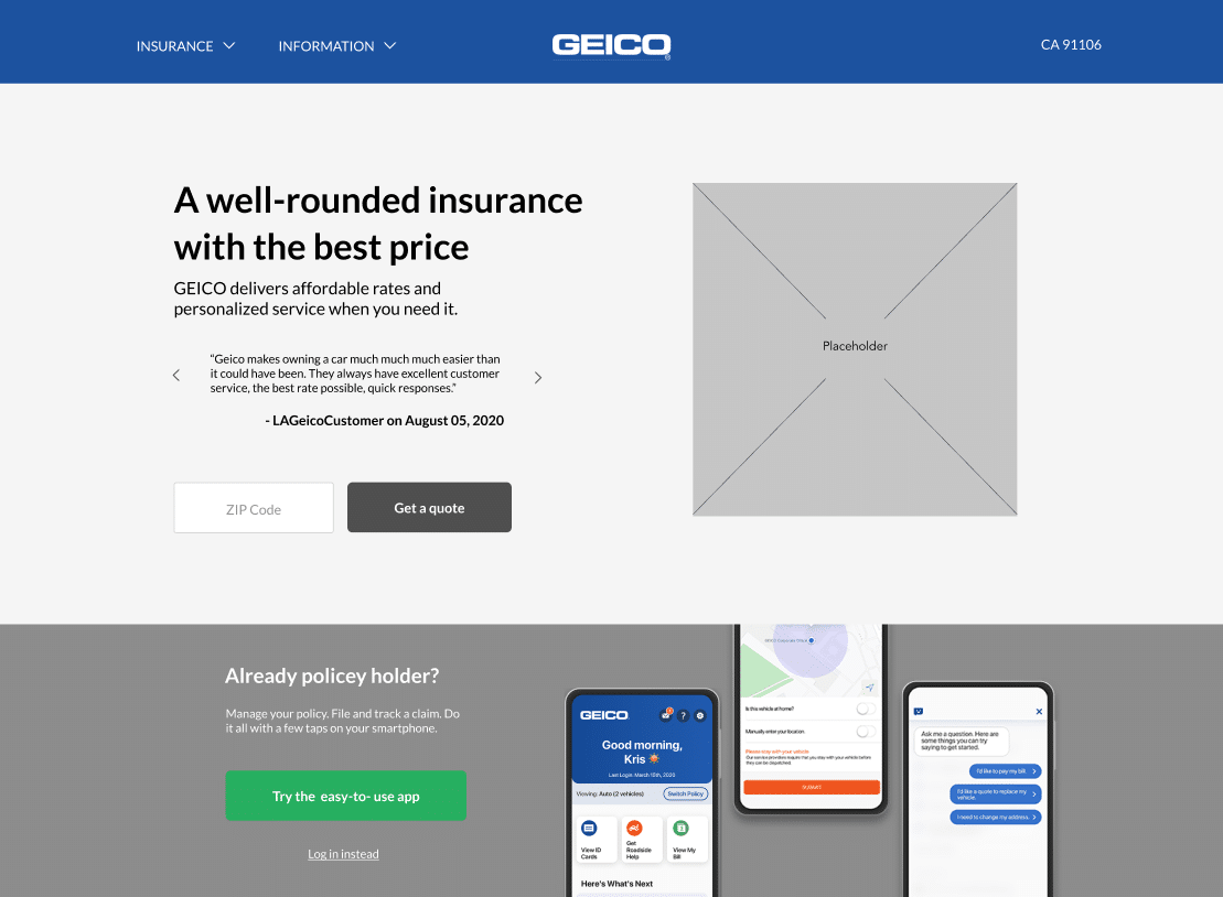
In order to achieve both goals. I add another section right down the hero image, which could be immediately seen by existing users when they log back to this page.I use text link to guide them to the app page. It’s also preventing too much CTA on this page
People like this most, since it’s noticeable. The only problem is the “get our free, easy-to-use app” isn’t clear. Does this ask new user to get a quote through the app?
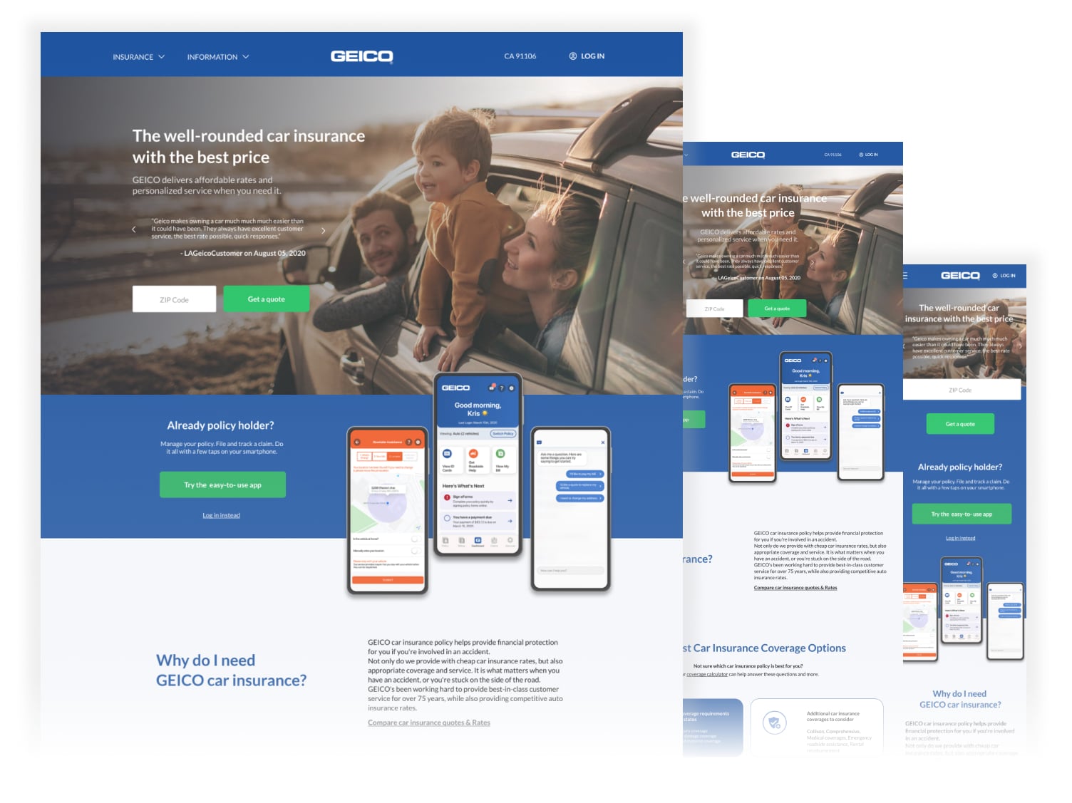
Final Design
The color and font I’m using come from GEICO’s existing visual system. I select green from Gecko as primary color used in CTA to in order to stand out to get user’s attention.
Self-reflection
I methodology I used in this project is similar with what I’ve done for other client: Conducted research to understand the users and product – brainstorm – concept test – wireframing -user test – iteration
but what makes this project special is insurance industry. It’s something that everyone would use it, but because of the complexity. People normally don’t have knowledge about it. So how to educate first-time user but not terrify them is challenging for me. In my solution, I inject knowledge into every section: such as using simple language, providing text link to GEICO’s other page, keep FAQ at bottom etc.
For next step, I would think about beyond this page to provide a better experience for the customers, such as the workflow of getting quote etc.